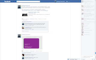
 Over the course of the Final Major Project we put together a Facebook Group to keep in contact when outside of uni. I found this to be really useful as we could upload our animatics/style frames/business card ideas ect... for advise and criticism on our ideas. It was also used to show research we had found in regards to each others ideas as Tom had come across some rotoscope work and posted them in the group for me. I used the group particularly for advise on my business card, fmp and also buying graphics tablets and cameras. As we are a very close group and all use facebook far too much this was most certainly the best way to easily keep in touch and show what we have been working on outside of university.
Friday, 11 May 2012
Facebook Group
 Over the course of the Final Major Project we put together a Facebook Group to keep in contact when outside of uni. I found this to be really useful as we could upload our animatics/style frames/business card ideas ect... for advise and criticism on our ideas. It was also used to show research we had found in regards to each others ideas as Tom had come across some rotoscope work and posted them in the group for me. I used the group particularly for advise on my business card, fmp and also buying graphics tablets and cameras. As we are a very close group and all use facebook far too much this was most certainly the best way to easily keep in touch and show what we have been working on outside of university.
Self Promotion
For my self promotion i created 50 business cards with the same design. I have had great feedback from them as they are really good quality and a nice simple design. A few weeks after this i decided that i wanted more ways for self promotion so i order 2 styles of postcards to send out to clients and leave out for people to take at the final show. I also made stickers for people to pick up at the show and maybe even send sheets to clients as i feel that everyone will enjoy this as a fun side to my self promotion. To show my moving image work i have a vimeo page www.vimeo.com/ashleighbutterworth this has all my work on to date and is available for everyone to look at it. I also have test work on youtube but i would like to add my final pieces there so that it may be possible for someone to stumble across.
I have enjoyed the self promotion and PDP side of this semester as i feel i have become more focused and confident with speaking to people within the industry.
Tuesday, 8 May 2012
Edits for Group Discussion - 03/05/2011
These are the three edits i had ready for our group discussion the week before the deadline. Although i hadn't managed to get all the frames scanned in i wanted to show what i had in a few different styles taken from my style frames to see what works the best. Out of the three the one with the newspaper print was the most popular as it added that extra aesthetic to my piece as it is very bare. However it was suggested that i change the type when the shot changes and try and find type that links with the music choice - which i think is a very good idea. It was also decided that the black on white worked the best rather than inverted but there should be some colour added to the scene to add that extra bit of detail to the dominant features of the animation.
Plan of action for the final week:-
- Scan in the remainder of my frames
- Add colour where necessary
- Find text that relates to Tin Hat Trio
- Make sure frames are aligned properly to stop the jump effect between each frame (fluidity)
Saturday, 5 May 2012
Tests - Scenery
Just some extremely rough tests to stop myself from sitting in front of my mac being counter productive. The first test i did to see how i could play with depth and how the character would interact and move around the scenery. It is very basic but i was simply trying to create a scene with more excitement than just the character walking towards the camera. The second test was to try and get a feel for the movement of the trees when rotoscoped. Although i have only used to images in a loop i feel that it will add an extra dimension to the piece to make the audience feel that all of it is really - the character the surrounding - they will all have life like in reality.
Subscribe to:
Comments (Atom)
