Monday, 22 February 2010

Colour...Ideas...

When i was out and about i found Henry the post! It looks as if someone has just graffitied a face onto a post in Marple Memorial Park.


I thought it was nice, bright, friendly and inviting it makes you feel happy!...well it makes me feel happy and very youthful!
However in the dark it may become very intimidating as if it is watching everything ... each move you make.

Thoughtful ideas agency ... blog...!

http://thoughtful.squarespace.com/

We had a talk from a design agency last week...after the talk i decided to see if they had a website or to see if i could find any other information about them. I came across a blog they constantly update which i think will help me in the future with my ideas, my creative/lateral thinking and also it may inspire me more to add ideas, and maybe just general thoughts to my blog more often!
http://www.dlkw.co.uk/


Pop art vauxhall corsa advert by DLKW London (1st February 2010)

I saw this ad when watching tv the other night i thought the use of a black car and a massively busy and bright background was interesting ... it gave me an idea to use something simple in the foreground of my video and use colour within the background as the dominant feature!
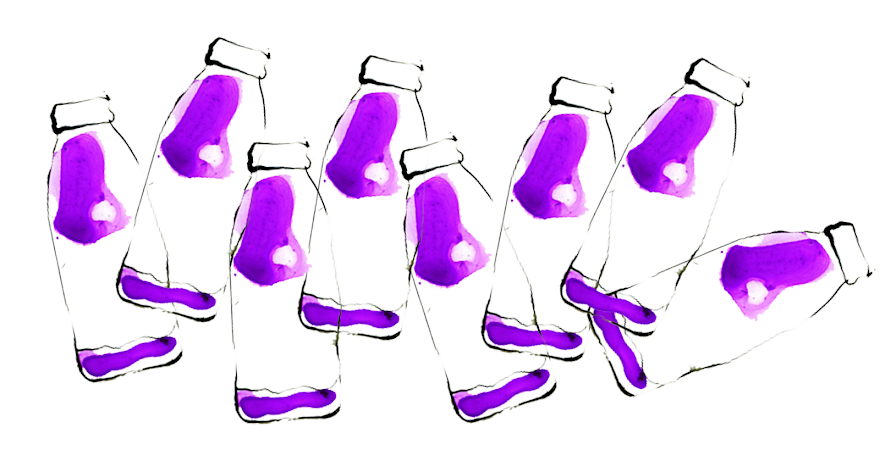
Thursday, 18 February 2010

Colour...Colour Wheel Idea?

Possible idea?

After a group discussion today i decided i wanted to make colour a huge part of my movie...i want to film things that are the colours from around the colour wheel maybe? using fast cuts to subtly make my way around the colours....i also want to add sections of black and white to show someone that maybe colour blind? things that we know the colour of without seeing it eg...banana=yellow, Orange=orange...


Monday, 15 February 2010

Editing...The Ring


I was looking at how i wanted to edit my video and i came across the 'cursed video tape' from the film The Ring (2002, directed by Gore Verbinski). This video uses very sharp and snappy short clips that really don't relate to each other at a first glance, i want my video to be similar although i will change the way we see things eg...black and white, sepia, blurred vision, very loud sound and very quiet sound ect...
I think this is a very good way of displaying the horror genre and i think this technique works well just showing snippets of the events because if they were longer they would be fairly disturbing.

Thursday, 11 February 2010

Colour ... Schindler's List


Similar to the photo of the Butterfly the whole film is set in black and white apart from the small girls coat! Obviously the use of colour is making the young girl stand out ... the use of red connotes the themes of film ... danger, death, struggle and war. The coat suggests she is vulnerable she stands out above the others around her. I would like to incorporate this technique within my short film however  i don't have the time or knowledge to create this yet so i want to use colour scenes and black and white scenes in my film as a starting point.