Saturday, 3 December 2011

Inspiration for aesthetic style - Quentin Blake


I have always been interested in Quentin Blake's illustration style, I love the use of sketchy black outlines and pale water coloured fill. As I am using ink to rotoscope for my 'Feel Good' brief I feel like this particular style will influence the style of my aesthetics, obviously I won't mimic the style but something similar.

Friday, 2 December 2011

Rotoscoping Test - Drawing directly onto the image

This is the first quick test I have made using the rotoscope technique, here I filmed myself putting on a jacket, edited it in after effects then exported as an image sequence at 12 fps to make my job less difficult, created contact sheets in photoshop, printed them out and drew in black biro directly onto the images. I do like this technique but it isn't right for the mise-en-scene of the advert, it is very dark and the lines are very thick i want something a little more intricate and hand crafted than this. Also i don't want the background to be seen as i want it to be all hand drawn so filming the final rotoscoping footage i think should be done by using acetate or tracing paper so i only pick out the figures movements and then i can create the surroundings.

Mini Blab 3

I really enjoyed the fact that a group of creative people from around Manchester was approached with a topic and asked to create a 15-minute presentation with the topic being 'Things you've seen'. Similar to our 'new way of looking' brief in the first year they went and found things that they would normally see around and about but never really give much thought to it until asked. It was really great to have short, snappy and very humorous presentations as I feel if one speaker is talking for a long time it tends to become fairly tedious and I loose focus.

There was one presentation that I think had the most effect on the speaker and me was Simon Griffin. He talked about ideas that stay hidden away in a 'notebook' and how we shouldn't hide them we should do something about it for our own pleasure (not just for business and money). It really got me thinking about some ideas about animations I would love to try but just don't seem to bother trying to create them even if just very crudely. Reflecting on my boat animation and my improvement in animation skills (even though still basic) I feel more confident in playing around with my own ideas and 'writing my own brief', which is something I never thought I would be confident doing this time last year since I struggled so much with my sonic project. So from this I have started to work on small projects of ideas that I have had so I can also place them in my showreel to show I am still working outside of what I am asked to create within Uni.

Thursday, 1 December 2011

Openbare Bibliotheek, Amsterdam

Arriving back from Amsterdam reflecting on what I have seen one place in particular that really excited me - Centrale Openbare Bibliotheek quite obviously located in the centre of Amsterdam.


Not only was the outside of the building amazing but as you entered the building it took my breath away. I have never seen a library so big in my entire life and what was nice about it was that it was so futuristic unlike a stereotypical library we would find in England. It is the largest public library in Europe with 10 floors in total, each floor rammed full of books on a huge variety of subjects.

As well as taking in the gorgeous interior they also had a graphics exhibition called 'Everyday Graphics' which contained a range of different work from still graphics to short animated pieces using symbols universally recognisable to everyone. There was one piece in particular that stood out to me and it was as soon as you entered the exhibition - It was a short animation named 'Logorama' and it is described as 'A short 16 minute animated film that depicts events in a stylised Los Angeles, and is told entirely through the use of more than 2500 contemporary and historical logos and mascots.'

Similar to that of the 'Kiss' i saw at the Whitworth Gallery it creates that interaction between the audience watching as you automatically want to point out what logo and mascot is and where is it from. Using familiar and universal images also gives a sense of versatility which can be understood by all. It is also a change to create an animation using imagery already created by others it adds that element of excitement as the mascots and logos are given characteristics and personas you wouldn't normally associate with them. In context the animation was projected onto a white wall to keep that clean, sharp and neat feeling as you do within the graphic industry. It made me think again how I can create an interesting way of presenting at the final show.
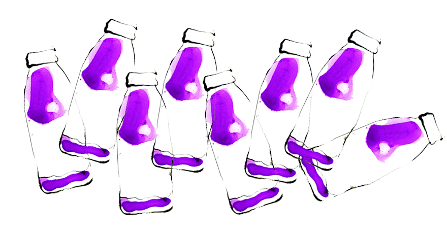
Friday, 25 November 2011

Portfolio Visit 2 - Holden and Sons

John and I teamed up for a portfolio visit to Holden and Sons Advertising agency in the Northern Quarter Manchester. As it was my second portfolio visit I had to make improvements based on my first portfolio visit. Also previous to this I attended the Thoughtful Lecture on 'portfolio etiquette' so I intended to showcase some skills I thought would make me appear more professional. The visit was with Peter Holden the creative director of Holden and Sons and some of the other members of the team wandered over every now and again. I showed my showreel first which he had seen on Vimeo but I had added some of my new rotoscoping so there was something new to be seen rather than just repeating the same work to Peter. I then showed him my 3D frog Nat Geo Wild Ident and finished off with my ink on acetate rotoscope tests. He didn't give me a lot of criticism on my showreel which I was bit disappointed about as it defiantly needs improvements so reflecting on this I may have to make it more exciting to gain a better reaction or even a reaction at all. However Peter was extremely excited about my rotoscoping, I took along my sketchbook and the acetate I had used as well which he seemed to be pleased to see. One criticism I did get about my overall portfolio visit was to appear more confident about my work.

Just before we left the visit Peter asked us to have a go at a brief for a company called Making Space a company who aim to help people dealing with mental health illnesses. He asked us to have a go at creating a 10 second animation to depict the overall purpose of the company using their logo as inspiration.

Wednesday, 23 November 2011

Tate Liverpool - Alice in Wonderland

While we were in Liverpool I wanted to visit the Alice in Wonderland exhibition at the Tate, as I have been fascinated with Alice in Wonderland from a very young age. I didn't read any reviews about the exhibition before I went so I was completely unaware of what to expect but I automatically presumed it would be illustrations and memorabilia from books and films and I think that is why I was extremely excited. However the majority of the exhibition was works inspired by Lewis Carroll's book, some of the work was ok but I wasn't too impressed. One piece that did stand out to me was a piece called 'Through the Looking Glass' by Douglas Gordon that had two screens almost facing each other on opposite ends of the room with a scene from Taxi Driver.

'Through a looking glass - consisting of two large-scale video projections which quote one of Hollywood's most memorable scenes. Using a monologue from Martin Scorcese's "Taxi Driver," Gordon traps the viewer between two images of Travis Bickle, one 'real' and the other a 'reflection of the real'. The projections appear at first to be mirror images of one another but they quickly trip out of sync and into a manic dialogue which bounces around the gallery, both visually and audibly.'

The reason this piece stood out to me was the fact you were enclosed within a black room that had two large projections of this scene where you constantly have to look back and forth from each screen, it was almost like you were involved and in the middle of the conversation. Over the last couple of months after visiting a few different galleries and exhibitions I have come to like the more interactive pieces what I mean by this is moving image and still pieces that make you feel a part of the piece like the 'Black Flood' and 'Kiss' at the Whitworth art Gallery. It makes the piece more interesting to watch and also engages conversation with the people you are experiencing it with, so you gain more than just your own thoughts and opinions.

Over all I think the exhibition was fairly good even thought it was not at all what I was expecting and I am glad i got to visit as for my final major project I have been strongly leading towards creating a piece of work inspired by a famous narrative and interpreting it in my own way.

Tuesday, 22 November 2011

Ink and Watercolour Animations


As I have an idea of what I want to include in my advert and the method I want to use to show it I needed to pick an aesthetic style that would go with the feel of the company and what it stands for. I want to rotoscope my final piece but I needed to find a way of adding colour in a way that relates to the product so in a group discussion we came up with the idea of using ink to show a liquid type effect which will connote that the product is a liquid similar to the look of the juice in water for the Robinsons advert. So I thought of using ink on acetate to achieve this effect. Looking at existing pieces of animation that use ink I have noticed that a lot of them appear within Chinese culture so I thought I would investigate further into this and use this as a starting point.


This is the type of effect I mean however this was created in 2003 in Maya in the 'style' of a Chinese ink painting.