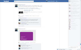
 Over the course of the Final Major Project we put together a Facebook Group to keep in contact when outside of uni. I found this to be really useful as we could upload our animatics/style frames/business card ideas ect... for advise and criticism on our ideas. It was also used to show research we had found in regards to each others ideas as Tom had come across some rotoscope work and posted them in the group for me. I used the group particularly for advise on my business card, fmp and also buying graphics tablets and cameras. As we are a very close group and all use facebook far too much this was most certainly the best way to easily keep in touch and show what we have been working on outside of university.
Friday, 11 May 2012
Facebook Group
 Over the course of the Final Major Project we put together a Facebook Group to keep in contact when outside of uni. I found this to be really useful as we could upload our animatics/style frames/business card ideas ect... for advise and criticism on our ideas. It was also used to show research we had found in regards to each others ideas as Tom had come across some rotoscope work and posted them in the group for me. I used the group particularly for advise on my business card, fmp and also buying graphics tablets and cameras. As we are a very close group and all use facebook far too much this was most certainly the best way to easily keep in touch and show what we have been working on outside of university.
Self Promotion
Tuesday, 8 May 2012
Edits for Group Discussion - 03/05/2011
These are the three edits i had ready for our group discussion the week before the deadline. Although i hadn't managed to get all the frames scanned in i wanted to show what i had in a few different styles taken from my style frames to see what works the best. Out of the three the one with the newspaper print was the most popular as it added that extra aesthetic to my piece as it is very bare. However it was suggested that i change the type when the shot changes and try and find type that links with the music choice - which i think is a very good idea. It was also decided that the black on white worked the best rather than inverted but there should be some colour added to the scene to add that extra bit of detail to the dominant features of the animation.
Plan of action for the final week:-
- Scan in the remainder of my frames
- Add colour where necessary
- Find text that relates to Tin Hat Trio
- Make sure frames are aligned properly to stop the jump effect between each frame (fluidity)
Saturday, 5 May 2012
Tests - Scenery
Just some extremely rough tests to stop myself from sitting in front of my mac being counter productive. The first test i did to see how i could play with depth and how the character would interact and move around the scenery. It is very basic but i was simply trying to create a scene with more excitement than just the character walking towards the camera. The second test was to try and get a feel for the movement of the trees when rotoscoped. Although i have only used to images in a loop i feel that it will add an extra dimension to the piece to make the audience feel that all of it is really - the character the surrounding - they will all have life like in reality.
Sunday, 29 April 2012
Break down of my narrative
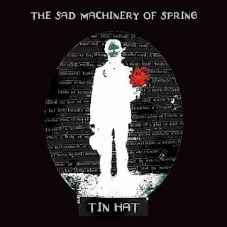 This is the Album cover from which the song I have chosen is from and allot of my ideas have been inspired by the name of the album and the album art itself. The idea of using a character with some robotic characteristics came from the title The Sad 'Machinery' of spring and the word spring inspired me to place the machine like character in a natural environment so man made vs. natural. The narrative shows the characters struggle to escape this nightmare of being within nature - nightmare coming from the song title 'The Land of Perpetual Sleep' perpetual sleep connoting enclosure, trapped in a situation where in which you can't escape. Through his journey he comes across another robot like character that is broken - he doesn't understand this and tries to give the character a red flower (inspired by the album art). The other character does not react which could portray that the broken robot has gone through the same experience but failed to get out. As a result of this the main character drops the flower and sits down next to the character in despair and the end I want to be open to interpretation - it could mean he’s given up/given himself to nature/he has finally be released from this nightmare/he will be trapped for ever in this state. So in essence it could be interpreted as a positive or negative ending.
Something that i am unsure of is whether i should make my ending restart at the beginning to leave the audience with an enigma, this idea came right at the start of the project and it has crossed my mind as it may make a stronger ending for my animation than my character giving up. This idea came from a film suggested to me called Triangle (2009) where in which a women is caught in a vicious circle of repeting the same events over and over again but from a different perspective. So to try and create this looping effect I intend to end the animation with the character ending up in the same position as the 'dead character' with the flowers positioned in the same place ect...
Triangle Trailor
Thursday, 19 April 2012
Style Frames
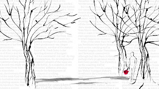
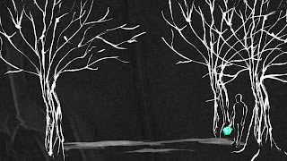
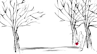
So after a tutorial with Rick we decided that I should create some quick style frames as to what I want the colour pallet to be like and how I want the scenery and character to appear before I start the rotoscoping. The majority of inspiration for these style frames came from the album cover in which the song has been taken. The first style frame I added text into the backgroud as that is the style the album cover has used. But I think this may disrtract the viewers eye away from the animation and I feel that I would need type that relates to the song/album I have chosen. Following on from this stlye frame i decided to remove the type and invert the imagery as this was one of my initial plans (also taken from album cover). I do like this effect, I wasn't too keen on it at first but after looking at it again I think it adds to the overall gloomy mise-en-scene. The only thing I have to be critical off is the flower colour when inverted so if there was a way i could keep them red i think this would look great - so after the final product is completed I will also create an inverted option and see which my peers prefer. Or maybe even keep the two one connoting a negative vibe and the other a more positive outlook. The last and final frame is simple black on white with a hint of colour from the flowers, I do like this because of its simplicity but I think I am more aesthetically drawn to the inverted style.
Wednesday, 18 April 2012
Group Discussion 17/04/2012
Today we had a group discussion about our progress since the 2 weeks off for Easter. To be honest I hadn't used my time that well over Easter to really crack on I spent too much time lingering over the aesthetics of a tree that the rest of the project fell away from me! So we discussed the narrative today and I know what I want to be shown but I need to find a way to explain this to the audience, examiner and Rick in a simple way so this still needs to be nailed. I also explained to the group that I have been rotoscoping individual sections of the animation then putting them all together in post production for example rotoscoping trees then adding the character in after. Reflecting on this approach I don't feel it is working for me as the different elements look out of place, they don't work together. So I have taken Ricks advice of putting together the videos/images then spitting them out as an image sequence and rotoscoping the whole thing together. This is how I approached my feel good animation and it worked really well and fitted together smoothly and successfully. After we talked about the narrative Rick mentioned how the music would fit with it and how the visuals will help express the music, so we discussed ways in which I could portray the music changes. Sarah mentioned an idea of the character running towards colour, as if he was chasing it but it was fading way, this could be shown by adding elements of colour to the trees and background and as the character approaches them it would have faded away. Or I could add colour to the background when the music changes pace adding a visual emphasis on it which I think could work quite well.
So here is the plan (to be done by Thursday 19th for tutorial):
- Get the shots needed filmed and edited together
- Add the trees and scenery to the shots to make sure everything is rotoscope as one
- Do a small test of the back ground with colour in as the music changed (10 second test at 12 fps)
- Do the test without colour
