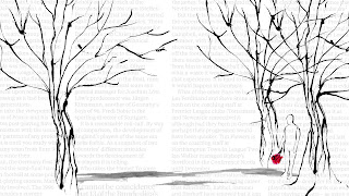
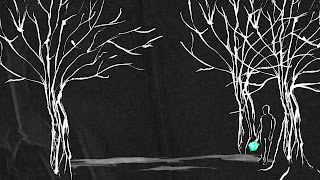
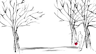
So after a tutorial with Rick we decided that I should create some quick style frames as to what I want the colour pallet to be like and how I want the scenery and character to appear before I start the rotoscoping. The majority of inspiration for these style frames came from the album cover in which the song has been taken. The first style frame I added text into the backgroud as that is the style the album cover has used. But I think this may disrtract the viewers eye away from the animation and I feel that I would need type that relates to the song/album I have chosen. Following on from this stlye frame i decided to remove the type and invert the imagery as this was one of my initial plans (also taken from album cover). I do like this effect, I wasn't too keen on it at first but after looking at it again I think it adds to the overall gloomy mise-en-scene. The only thing I have to be critical off is the flower colour when inverted so if there was a way i could keep them red i think this would look great - so after the final product is completed I will also create an inverted option and see which my peers prefer. Or maybe even keep the two one connoting a negative vibe and the other a more positive outlook. The last and final frame is simple black on white with a hint of colour from the flowers, I do like this because of its simplicity but I think I am more aesthetically drawn to the inverted style.


No comments:
Post a Comment
Note: only a member of this blog may post a comment.