Friday, 25 November 2011

Portfolio Visit 2 - Holden and Sons

John and I teamed up for a portfolio visit to Holden and Sons Advertising agency in the Northern Quarter Manchester. As it was my second portfolio visit I had to make improvements based on my first portfolio visit. Also previous to this I attended the Thoughtful Lecture on 'portfolio etiquette' so I intended to showcase some skills I thought would make me appear more professional. The visit was with Peter Holden the creative director of Holden and Sons and some of the other members of the team wandered over every now and again. I showed my showreel first which he had seen on Vimeo but I had added some of my new rotoscoping so there was something new to be seen rather than just repeating the same work to Peter. I then showed him my 3D frog Nat Geo Wild Ident and finished off with my ink on acetate rotoscope tests. He didn't give me a lot of criticism on my showreel which I was bit disappointed about as it defiantly needs improvements so reflecting on this I may have to make it more exciting to gain a better reaction or even a reaction at all. However Peter was extremely excited about my rotoscoping, I took along my sketchbook and the acetate I had used as well which he seemed to be pleased to see. One criticism I did get about my overall portfolio visit was to appear more confident about my work.

Just before we left the visit Peter asked us to have a go at a brief for a company called Making Space a company who aim to help people dealing with mental health illnesses. He asked us to have a go at creating a 10 second animation to depict the overall purpose of the company using their logo as inspiration.

Wednesday, 23 November 2011

Tate Liverpool - Alice in Wonderland

While we were in Liverpool I wanted to visit the Alice in Wonderland exhibition at the Tate, as I have been fascinated with Alice in Wonderland from a very young age. I didn't read any reviews about the exhibition before I went so I was completely unaware of what to expect but I automatically presumed it would be illustrations and memorabilia from books and films and I think that is why I was extremely excited. However the majority of the exhibition was works inspired by Lewis Carroll's book, some of the work was ok but I wasn't too impressed. One piece that did stand out to me was a piece called 'Through the Looking Glass' by Douglas Gordon that had two screens almost facing each other on opposite ends of the room with a scene from Taxi Driver.

'Through a looking glass - consisting of two large-scale video projections which quote one of Hollywood's most memorable scenes. Using a monologue from Martin Scorcese's "Taxi Driver," Gordon traps the viewer between two images of Travis Bickle, one 'real' and the other a 'reflection of the real'. The projections appear at first to be mirror images of one another but they quickly trip out of sync and into a manic dialogue which bounces around the gallery, both visually and audibly.'

The reason this piece stood out to me was the fact you were enclosed within a black room that had two large projections of this scene where you constantly have to look back and forth from each screen, it was almost like you were involved and in the middle of the conversation. Over the last couple of months after visiting a few different galleries and exhibitions I have come to like the more interactive pieces what I mean by this is moving image and still pieces that make you feel a part of the piece like the 'Black Flood' and 'Kiss' at the Whitworth art Gallery. It makes the piece more interesting to watch and also engages conversation with the people you are experiencing it with, so you gain more than just your own thoughts and opinions.

Over all I think the exhibition was fairly good even thought it was not at all what I was expecting and I am glad i got to visit as for my final major project I have been strongly leading towards creating a piece of work inspired by a famous narrative and interpreting it in my own way.

Tuesday, 22 November 2011

Ink and Watercolour Animations


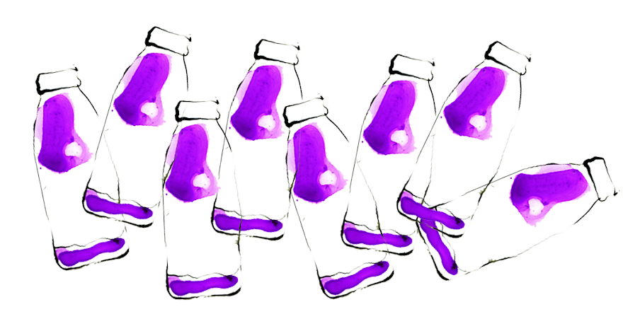
As I have an idea of what I want to include in my advert and the method I want to use to show it I needed to pick an aesthetic style that would go with the feel of the company and what it stands for. I want to rotoscope my final piece but I needed to find a way of adding colour in a way that relates to the product so in a group discussion we came up with the idea of using ink to show a liquid type effect which will connote that the product is a liquid similar to the look of the juice in water for the Robinsons advert. So I thought of using ink on acetate to achieve this effect. Looking at existing pieces of animation that use ink I have noticed that a lot of them appear within Chinese culture so I thought I would investigate further into this and use this as a starting point.


This is the type of effect I mean however this was created in 2003 in Maya in the 'style' of a Chinese ink painting.

John Lewis Advert


After watching the new Christmas ad for John Lewis and I came across this older John Lewis advert and i was extremely interested in the transitions as i am finding it hard to gain successfully transitions within my boat animation. I love the way objects are used to create transitions to portray time passing which is exactly what i need to portray to my audience.

John Lewis Christmas Advert


I watched the John Lewis Christmas Advert for the first time yesterday and i have to say it is one of the best adverts i have ever seen!
Going back to the quote:

"The explosion of new technologies and the proliferation of new channels have served to remind us of one ancient imperative of the human race, the need to tell stories. As the oral tradition becomes a digital tradition, stories have never been more important."(Euro RSCG Worldwide)

I believe that this advert portrays a small but sweet narrative of a child counting down the days till Christmas. It works successfully because the majority of the audience will have experienced this as a child automatically gaining a large connection with a huge audience. After looking back at a few of the other John Lewis Christmas advertisements i have notice that nostalgia is used by making children the dominant characters when the advert is aimed at adults. I was thinking of using nostalgia within my feel good adverts to get my audience to remember those 'feel good moments' within their life - things that a large audience will of experienced and hopefully get across the message that these feel good moments will be like the fruity goodness of the drink. Also similar to that of the John Lewis' Christmas adverts which i look forward to every year the idea behind the different series of 'feel good moments' is the intention to get people to look out for them to see what other 'feel good moments' will appear and if they will remember them and agree.

Monday, 21 November 2011

Previous Adverts

I wasn't going to look at the existing adverts for Heinz Salad Cream and Feel Good Drinks incase i became attached to their success and subconsciously create something very similar. However while talking to Chris she suggested that it would be a good idea just to gain a visual understanding of the companies personality and mise-en-scene.

I could only find one professional advert for the Feel Good Drinks Company as the rest seem to be competition entries as i found that they nearly always have a brief for YCN.

This advert shows the bottle within nature when at its best connoting that their drink is healthy and good for you. I love the use of bringing the bottle to life but i feel this may be a very obvious option so i don't mimic this ad i would like to create visually something totally different yet with the same mise-en-scene. The ad has been animated and not shot in live action which is something to consider, the use of animation here helps to create things that don't exist and wouldn't normally have life added that little bit of excitement to engage the audience. So is some sort of animation the best way forward?

Heinz Salad Cream has had a number of adverts as it has been around for a long time so i thought i would have a look at a few of them to get a feel of what they want to portray.


All of these adverts are shot in live action and have an upbeat vibe with a comical twist. They all also have a tagline at the end of them that will rhyme with 'Salad Cream' for example 'Any food tastes supreme with Heinz salad cream' i think this helps the audience to take something away from the advert to remember because ever since watching these adverts it is one of the first things i remember. In relation to my ideas then the use of comedy is needed to keep that positive persona and something shot in live action so it portrays reality and its something that is accessible to all.

Finding a Brief

After looking through all the competition briefs the two that interested me the most were both YCN - Heinz Salad Cream and Feel Good Drinks Company. The reason I was interested in these were because they were very upbeat and fairly open and after the boat animation i feel more comfortable almost writing my own brief. Where as last year i would of really struggle but now i have become more confident with myself and my ability to manage time and create a more successful body of work. The reason i have chosen a brief that is fun, cheeky and exciting is because i have never apart from my Sega brief thought about creating a quirky piece so too add something with a different vibe into my showreel i thought would be great.

My over all understanding of the briefs:

Heinz Salad Cream - The aim of this brief is to give life back into the product and get an audience aged between 18-29 to eat salad cream again or for the first time. One thing that stood out to me in the brief was the quote

'Get the young eating Heinz Salad Cream again!'

This automatically embedded itself into my brain which made me think that possibly a bit of nostalgia needs to be included and with this in mind i will look into the history of salad cream.

Feel Good Drinks Company - There were two briefs to choose from but i have chosen the first and one word that is prominently used within the brief is

'Awareness'

So the brief is asking for is a creative idea to make the public more aware of the Feel Good Drinks Company, their products and how it is a more healthy drinks option when on the go. The target audience is 16-34 which ranges from college and uni students all the way through to professionals. This is a fairly large audience to capture so the final piece must be appropriate to suit all areas which may be difficult but i think i like that kind of challenge. Compared to Salad Cream the Feel Good Drinks Company hasn't been around for as long so something needs to be created to make this audience notice and fully understand the product.

SO i will develop ideas for both of these briefs then hopefully find one that i can peruse to a final piece.


.

Saturday, 19 November 2011

Liverpool - Fact

On Thursday 17th November Kirsty, Oriana, Rick and I went to Liverpool to check out Kurt Hentschläger's Zee at the art house Fact, after hearing John, Jack and Tom talk about it we thought we would experience it for ourselves. Before I went I had previously heard of Abandon Normal Devises as my boyfriend is an Art Student at MMU who has been set a brief with it in mind but he didn't really tell me what kind of work they did or what it was about so it was really great to go and experience and learn about something totally new to me.

Ok so I was a bit nervous about entering the exhibition as Tom, Jack and John had said it was a bit strange and I had heard you can only breath through your nose and there were a few precautions to take which made me very wary but never the less I went in! Out of the four of us I was the first to enter grabbing the rope straight away being very cautious as to where I was walking, we followed the rope for a good while then decided to stop and let go! However Kirsty and me decided to hold hands so that we didn't loose each other, which could have possibly ruined the experience a little, but under no circumstances did I want to let go of Kirsty. For the first 5 minutes or so I was a little bit petrified as I was thinking too much about the fact I couldn't use my mouth to breath but as I calmed down a little I started to really enjoy it. Some people have described the experience as “insane”, “like entering Heaven” and “another planet,” all three of these I think describes the experience well.

Over all I am so glad I went in as I don't think I will ever experience anything like this again!


Wednesday, 9 November 2011

Portfolio Visit - Huckleberry Films

Today I had my first portfolio visit of the year and I would class it to be my first ever proper portfolio visit. I went up to Accrington to visit Huckleberry films, I was very nervous on the way up but also very excited to gain an incite into the moving image industry and to see what they thought of my work. The small studio is run by a couple, Caroline and David who both participated in the portfolio visit which was great to get feedback from two people rather than just one! The feedback I received about my work was good; they particularly liked the boat piece but did mention that my showreel was slightly repetitive as I was too picky about what work I chose to include. They said they would of liked to have seen a bit of the making of for each project because they find that this is more interesting to watch just as an incite to the effort and time gone into making each piece. I am so glad they were very honest and not harsh about their advise and I will take this on board and make sure throughout future projects I will create a making off just to showcase all the behind the scenes action.

Friday, 4 November 2011

3D Lecture - 13th October 2011

As I am investigating the use of 3D cinema in the present day within my dissertation I thought it would be a good idea to attend the 3D lecture to try and enhance my knowledge of its history and development.

The information that I have thought about since the lecture that really interested me was some of the facts about its history that opened the talk. I was unaware of the fact that directors have dabbled in the field of 3D cinema since the 1920s but just hadn't quite managed to perfect the art resulting in 3D disappearing and reappearing then disappearing again from the film industry. Also I was unaware that in the 1950s the coronation was also filmed in 3D even though the footage was not shown in 3D it was still being explored.

After the lecture I realised that I have been very naive and narrow minded to assume that 3D has been a very recent development within film.

Aside from this overall I found the lecture very fascinating as it was great to find out what we can expect from 3D as we head into the future however I felt that the lecture was hugely tech based and I found myself getting lost. I was hoping that there would be more about the history of 3D, how it may compliment or limit the narrative within film and the audience’s reaction to the use of 3D. I also found that the majority of the lecture was based around 3D television within the home and to be honest it is not something that interests me. I think 3D should be limited to cinema as I think when it is accessible to the majority of the population to use within a home environment it looses it excitement of going out for that exclusive cinema experience.