Friday, 26 August 2011

Style Frame

This is what i keep seeing in my head for some strange reason ... yes a tractor i think it is from spending too much time in the countryside! So i thought of a way i could make it interesting and what better way to do it than to add some texture and pattern into the design. The hills are split into sections which is taken from my inspiration 'Tiny Wings' and as they use texture i have added pattern to make it slightly different and just as interesting and colourful. From my idea of using the 4 elements this one will symbolise earth as farmers literally live of the earth that is their source of income and how they survive. After i knew how i wanted my frames to look i thought of how i could portray the other elements and with a similar meaning to this i will use a fishing boat for water.
Note to self - these are not necessarily the final compositions as i need to play around with the colour/pattern and overall layout to make sure i portray the correct mise-en-scene to the audience. I still need to decide on what events will occur within each scene and that will then give me more of an incite into finding the correct colour scheme and composition.
(These are simply visuals that i keep imagining ... i wanted to make sure i documented them before i started my development.)
Even though they are just examples of what i want the final piece to look like i still haven't just placed different patterns and texture into my hand drawn images willy nilly i have tried to carefully consider the colour and the amount of pattern that goes into each individual section to make sure i get the hang of making sure the composition is clear and understandable to the audience. For example in the both of these style frames i have used pastel colours for a calm and relaxed vibe to portray a calm and peaceful environment.
Here is a quick test i am in the middle of developing in after effects of my rough thought process of how i want the animation to look, i want everything to be hand drawn in black Biro/ink, scanned in and then animated in after effects as i really want my after effects skills to improve! The test is currently only 2 seconds long and the movement of the boat is not great but i wanted to just make sure i would be able to animate successfully in after effects and i think the single splash i have created works successfully.
Henri Matisse and Picasso

After i realised what style i wanted to use i then wanted to look at line drawings by famous artists as all the components in my animation i shall hand draw by just using the outline and then later filling the spaces with wallpaper patterns and textures. I have mentioned Gustav Klimt already as he is one of my all time favorites and as i thinking about him i remembered some of the other artists i looked at in my first year of college in a life drawing lesson that i also really liked.
Similar to Klimt Matisse is another artist who used line drawings however they differ in the way that Matisse only uses one confident line to represent the shape of the female form. I think in this way the images are more simplistic and less realistic but again the movement, cures and grace are shown with just simple lines. But looking at the technique i want to use this style would be no use as there are too many gaps within the lines which gives an almost unfinished look and since i am adding detail into the spaces and shapes leaving gaps within the original drawing would make things a lot more difficult and messy.
Again this technique i wouldn't be able to use for the same reason as Matisse but i still wanted to mention Picasso's line drawings as again they are so very different. This time it is not a portrait, Picasso has looked at animals and used ONE line to create a shape that we as the audience would recognise. These images are so fantastic i think even though they are so unbelievably simple, they almost look like small illustrations for a children's story.

Thursday, 25 August 2011

Ideas and Inspiration

Ok so i have realised i am into hand drawn/traditional animation but i don't think the frame by frame drawing is for me as i can't seem to get my head around it SO i thought about drawing the elements of my animation separately then scanning them into my mac and animating it in after effects rather than by hand but i am still using the hand drawn element. So my next step will be to test this! Another thing i have realised is i am not too good at drawing people and animating them correctly so i am going to try and steer clear of using characters within my animation until i feel confident enough to do so. (I am going to keep developing my life drawing skills throughout the year to see if i can crack it!).

INSPIRATION
I recently bought a game for my I phone and i love the graphics on it, the game is called Tiny Wings and here are some examples of a few of the levels.

I think the reason i like them is because the colour pallet within each level is very complimentary and very subtle, it all seems to feel peaceful and serene. For a game i think this is very unusual as you would expect the colours to be bright and bold. I also like the use of such simple shapes to portray the object within the game and you always know exactly what they are, its very abstract. This is the kind of look and feel i am going for.
Then i thought of what i could animate in this way and i thought of the 4 elements - water, earth, air, fire because i think this kind of feel would be most appropriate and as each level is a different colour scheme that is how i would show the elements. Over the summer i have spent a lot of time in wales and where better to collect bits and bobs from than the sea side! So i thought of representing Earth with a tractor and lots of fields in a similar style to 'Tiny wings' as they are almost like owners of the Earth, they live of it, its how they earn money to live. For water i took a photo at the start of the summer of a harbor at sunset with small fishing boats on it and again they are fishing for a living just like a farmer wood and it fits in with the whole peaceful and gracefulness of the animation. I am undecided about air and fire at the moment so i am going to test earth and water to see how it looks and then develop air and fire as i go along.

Sunday, 21 August 2011

Final Evaluation

A few weeks ago i went in to show Rick what i had done so far and we had a chat about things that i could improve on and things i needed to change.
So the first thing i changed was i made the video widescreen before i started to do anything else and then i sat down and watched what i had and made a note of what i needed to change to get the animation just right.
So the next thing i decided to change was the type at the end of the animation so i had a look at the type used in the actual game and game promotion and in the end i decided to go for the Sonic title font. The reason for this is because i felt it would be the most recognisable to the audience also its bold and chunky so it is very easy to read and so it went nicely with the Sega logo i made the other type the same colour.
One thing i was really struggling with was the tagline i have tried to develop it a million times but it is not my strongest point so in the end i decided to use '20 years of sonic' (to make sure i was promoting the anniversary since that is what the brief has asked) 'Relive the adventure' (the only worry i have with this though is it only really grabs one of the target audiences, the people who have already played the game. However i then realised what it will do is make people want to pick up the game again and start playing or even make those new, younger members of the target audience think they may be missing out and want to start their adventure.)
Then what i needed to do was find a song that would fit really well, i was going to use the original sonic theme tune on the first game but i find it too obvious and very annoying so i looked into other options. I knew i wanted to use a song from one of the sonic games to keep it as close to the game as possible and i did find a song on youtube but i am unsure of which game it is from but it defiantly sounds a lot better than the original song i had chosen. The song i did choose was from Sonic the Hedgehog 2 'The chemical plant zone' and i just think its slightly different from the 'green hill zone' music which was very cliche but still gives the same feel its just slightly more edgy and feels new and fresh.
After this i then studied the game a bit more looking at the pace of it and what happens to sonic when he hits an obstacle or enemy and tried to replicate this the best i could. From the beginning i couldn't get it right it was always to fast or just looked a bit odd but after looking and playing the game myself i think i have managed to make it look very similar and now people who i have shown my work to have been able to understand what is going on.
The next thing i wanted to do was play with the composition of the shots to see if i could make them more exciting, i tried making the images bigger cutting off sections in the shot and making some of the images smaller to fit more of the surroundings in.
Overall the animation has really developed from when i went in to talk to Rick and i now finally feel happy with the end result and i also feel more confident with working in after effects and the quality of the video when it is exported is so much better of that in premier. If i was to do this project over again from the very beginning i would of worked this way from the start but i still feel that getting a second chance to re do the project has really helped the way i work develop so i feel prepared for my next project and i know i will finish it successfully and on time!

Niki Pilkington email reply

In response to your questions:


What inspires your illustrations?
It may sound obvious, but the person I'm drawing is the biggest
inspiration on what I'm drawing. Whether I'm working from found images, or
on personal commissions, for me, the most important part of my work is
that I portray certain personality traits of the girl that I'm drawing and
allow the viewer to get an insight of what she's all about. I draw these
girls because they lure me in for some reason, and I want the person
looking at the picture to feel the same way. If you're going to tell a
story, I believe you should tell it right.

...the use of the pencil drawings with the coloured cut outs and coloured
sections what made you decide to do this?
It's just a style which has evolved over time I guess. I've always wanted
to find new ways to try to bring my pictures to life and I feel like this
is the best way for me to do that. I like combining the different
dimensions - it's fun to make and hopefully fun to look at too. I don't
take my work too seriously, which makes mixing my detailed pencil drawings
and all these childlike materials and techniques easy.

Saturday, 20 August 2011

Tests and Development

Ok so this is another test i did to in after effects, i have made the video into widescreen like is should be and i have played around with the part where sonic falls into the water. I watched someone play the original sonic game on youtube and i have noticed that when sonic hits his enemy/obstacle/water he flashes for about 2 seconds whilst your still moving him. So what i have done differently in this one is as soon as he hits the water he flashes and he continues to flash as he starts rolling again. I think this represents the game so much better and i showed one of my friends this video and she even said 'awww he is flashing like in the game' so i think i have finally cracked that! Also just to mention i haven't yet added the start and correct finish to the animation i am just focusing on the original footage that i have so i can plan properly how long i have to add them in.
I wanted to keep playing with the tests so i played around with the positioning of the images in shot and the timing of the type at the end. I do like the text and the way it appears on screen but i still think it is too slow it needs to be constant, sharp and snappy just like the animation and the game would be. Also after i had exported the movie i have realised that some of the shots sonic is completely cut off and it is just close ups of the floor/object he is suppose to roll across so i need to go back and re look at this.
Still not beginning but what i haven't mentioned is that after the first test i removed "remember me" for the tagline as i don't think it fits so at the moment it is just "20 years of sonic, relive the adventure' this still needs some work i think so i am going to keep playing with this but use it for now just to map out where it should be and the speed of its appearance. I still have managed to get the speed right i still think it is very slow but i think the rest of the animation is working maybe just need to try moving things around to see if there are any other options to make it more exciting.
Ok now i have added the beginning and the end, i have tried to create a sense of enigma at the beginning of the animation and i have certainly done that as the clips are way too fast that you can't even tell whats going on! So these now need to be slowed down so that they fit nicely with the rest of the animation. At the end of the animation i have still used a clip of sonic walking towards the camera but this time i have added a wink at the end just to show of sonics cheeky persona and i feel that it is an end to the animation not just cutting out into type but like the beginning it needs to be slowed down.
I have tried messing around with the beginning of this test and i have made a few mistakes and its all over the place and one of the clips sonic is cut off again so i need to revisit this. I feel that the type at the end is getting there, the speed it almost perfect and i defiantly like the fact each word comes up individually because it makes it more legible the audience are more likely to pay attention when they aren't over faced by text. So its slowly getting there!
I added sound to this one and i thought i had faded in and out but i haven't and it sounds terrible! I want to experiment with the soundtrack too, this one is the most obvious but will help the audience understand but i am going to try a few tracks all from the sonic games but maybe a bit less obvious and less annoying! I also made the speed of the video faster and i think it works better but the bit where he falls into the water needs to go back to the speed i have had it as i think its too fast now.
I tried another song and i think i prefer this, i am not too sure which Sonic game it is from but its different and has a bit more of a beat. This animation overall is by far the best just a few more tweaks here and there to make sure everything is perfect but hopefully it will finally be complete!!!

Soundtrack?

Now i need to find a song that will fit nicely with my animation so i started off by typing 'sonic soundtracks' into you tube to see what i could find and the first one i came across was The sonic 'green hill zone' which is one of the original and most famous soundtracks of the game. I am going to try this over the animation on one of my tests to see if it will fit as i think it will probably be the most popular and recognisable.

Then i looked at loads more but i don't think they will fit as the tempo and overall feel will not suit the overall mise-en-scene of my piece. Here are a few more examples of songs i looked at.

The 'Marble zone' music was a bit too slow for the pace of my animation and a bit too deep, its not exciting enough so i kept on looking.
I then stepped away from the first Sonic the Hedgehog and looked at ones from Sonic the Hedgehog 2 but again it was too deep and not exciting enough for the pace of my animation and i didn't want to steer to far away from the original game which is most likely for people to pick up the music from.
So again i reverted back to the original Sonic the Hedgehog 1 but this one is far too slow and has a very, very relaxed feel to it and i want my piece to be a bit mental and a lot faster so i continued my search for the right soundtrack.
Then i came across this soundtrack from Sonic the Hedgehog 2 'The chemical plant zone' which i love ... it still sounds like a sega made sonic theme tune but feels a lot newer a lot more exciting than something people are going to expect to hear. It also gives a small enigma to the piece but not enough so to not realise what it is!
So i then found another song but again was too slow so i know i am defiantly going to try the original 'green hill zone' and 'The chemical plant zone' from Sonic 2 and see how i get along with putting them over the animation to then make my final decision.

List of things to do!

2/08/2011
So i went for a talk with Rick and we had a discussion about things that need improvement and what i was missing so this is a list of things i need to do before Monday 22nd August.

1. Explore the type used within the sonic game/game promotion to find a subtable font for the end of the animation.
2. Play with the composition of the type to find a more exciting way to show it of.
3. Reshoot the beginning of the animation to stop shadowing.
4. Look more closely at the pace of the game to get a more realistic feel to it.
5. make the end of the animation look like the end as at the moment it just cuts to type.
6. Play around with the tagline to make it better and make sense!

For future reference i need to make sure that my decisions are backed up and have a purpose and are not just put there because it looked ok.


Monday, 15 August 2011

Finding the right type!

After a meeting with Rick i actually realised that some of the decisions i have made or lack of need to be backed up with a reason. For example the type at the end of the animation actually had no relevance to the piece it was the first font that came up and i thought it looked ok. So i had a look at some packaging and font existing within the game and used to promote it to give me a better understanding of what it recognised to portray Sonic the Hedgehog/Sega.
The first font i tried was the sega logo font which i found on Da font and placed it at the end of the animation but i don't think it works that well as it is too clumpy and in your face however is that what i am after? Sonic is fast, exciting and in your face and at the end of the day in the brief it mentioned the aim of the piece is to promote the company using its most successful character as the dominant feature. I couldn't upload the video to my blog but it is on my pen drive in the folder 'tests' and it is called 'sega font type'


Sunday, 14 August 2011

Gustav Klimt

Looking at different drawing styles i had to include my all time favorite artist Gustav Klimt, when i was in the first year of college we went to the Tate Modern in Liverpool to see his exhibition and it was one of the best things i have ever seen! His work is so intricate and well planning its astonishing! But one of the most memorable sections for me was a small collections of simple pencil sketches, i am so in love with the mass variety of styles from pencil drawings and how they can be so unbelievably different. I find it fascinating how the use of simple lines can portray so well the movement, grace and beauty of the object.One other thing i love about Klimt is the majority of his work is left unfinished and i just think it adds that extra enigma to the piece of why it was never finished (similar to the 'Thought of you' animation by Ryan Woodward).

Portrait of a Lady (Unfinished) 1917-18


Friday, 12 August 2011

Someone playing Original Sonic


I wanted to add this to my blog just to remind myself of the overall mise-en-scene of the video game and pay closer attention to the sound, colour scheme, appearance ect... After a talk with Rick i realised i do need to pay a but more attention to these things as i have lost them within my piece and i need my animation to reflect the game properly.

Walt Disney - Tests/Animatics


I know this is an animatic but i love the roughness to the animation the 'unfinished' look this is what i am going to try and aim for however i can't seem to master hand drawn animation which is all drawn i can't seem to get the movements right so i am thinking of rotascoping ... so filming the basic shape and drawing around this how i want it to look. It will be hugely time consuming but i have gone through the first to years with set briefs and not being able to pick them up and create something amazing so i would like to give this ago as i think drawing (expressive drawing) is a strength of mine so with the help of rotascoping (slightly cheating) my throw me in the right direction. Hey, i might eventually crack some hand drawn animation but for now i want to start with rotascoping to try and get my head around things.


Here is another one i found from Walt Disney's Beauty and the Beast but there is commentary from the producer Don Hahn and its really interesting to get a feel of how they work at Walt Disney. One thing i did find especially interesting is that one animator will start off by drawing the main, major poses for a character then someone else or a number of people will fill in the in between shots and they call these people the 'inbetweeners' so for one character 2 or more animators will have worked on it with slightly different drawing styles (obviously) but it is to look as if one person has animated it.


This is a quick snippet of James Baxter working on the ballroom sequence in beauty and the beast, this by far is the most phenomenal piece of hand drawn animation with a hint computer graphics i have ever seen, it is drawn to look as if a camera is panning around a ballroom, it is absolutely stunning and it is interesting to see it in a pencil test.
"The ballroom sequence is the bonding moment of the film when the two main characters finally get together," says Hahn. "For us as filmmakers, the computer offered us a way to get heightened emotions on the screen and more dramatic effects than we could have gotten conventionally. It allowed us to move the cahttp://www.blogger.com/img/blank.gifmera around and take a look at the room instead of just looking at a flat piece of artwork. Technology as a whole is an extension of our fingers, hands, and minds. Computer graphics let us go beyond what we can currently achieve with pencil and paper or paint and a brush." Don Hahn
http://www.digitalmediafx.com/Beauty/Features/originalbeauty.html

Here is the finished scene in the film and it is amazing i have never really looked that close at it before but the representation of a camera flying around the room is almost mind blowing it looks so realistic and almost makes us believe the characters are within real life surroundings. AMAZING!

Tuesday, 9 August 2011

Movie Posters

They also use the Teaser and Official film technique for movie posters to advertise the film in the teaser poster like in the teaser trailer they keep the imagery very simple with clues as to what the film may be about, it creates an enigma again to make the audience question what it is about and look for further clues. Then the official film poser that will appear before and stay out during the release of the film will show characters and give us a clear visual story of what the film will be about.
The teaser poster for Super 8 (2011) is simply the lens of the camera used to make the super 8 film to suggest some sort of mysterious recording but not a lot at all is given as a clue especially if you are unaware of what 'super 8' is like i didn't until a few hours before watching the film.
Teaser
Official Poster
The official poster for Super 8 shows all the main characters, the larger and higher up in the poster they are connotes their dominance within the film similar to the order of appearance in the trailer. It is also made to look like an older/classic film poster to tell the audience that it is set in past times and not the present or future.
Here is another example but with this it is slightly different as there has been films, TV shows and comics that have the same character therefore on the teaser poster they will use some sort of symbol/colour that the audience will recognise to start the hype. (The Dark Knight, 2008) Here you can see the suggestion of 'the jokers' face spray painted on a white wall with the Batman logo for a mouth so straight away all the clues come together but it doesn't give any clues to the storyline apart from inform the audience of the dominant character which would be the Joker.
Teaser

Official
The official movie poster includes a photo of the character with weapon in his hand and a path of destruction behind him telling the audience he is the bad guy and the film is about the Joker and his actions. The poster still includes Batman's logo but its not as prominent because by this time there is enough visuals on the poster to tell us what the film is about, but it is still used to keep the message clear.
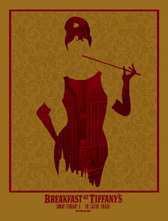
I have looked at fairly recent films so i decided to investigate further and see if i could find some older film posters to see if they use the same promotion technique and i found that Breakfast at Tiffany's (1961) has a teaser poster before the official one. The teaser poster shows a glamorous womanly figure without any features so you are unaware of her real identity with building as the pattern of her dress including the empire state building telling the audience it is about a glamorous woman living in New York but does not tell us anything at all about the story line.
TeaserOfficial Poster
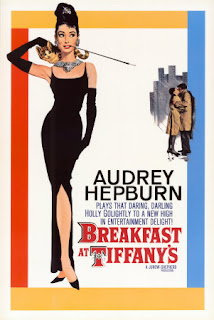
Where as the official movie poster shows the actress Audrey Hepburn in the famous dress and memorable hair style from the poster above which is how the two will be connected by the audience's memory. But this time there is a small image of a man and a woman who we presume to be her in the right corner of the poster connoting some sort of love story and again buildings behind them to portray a big city in this case New York as seen in the teaser poster.

So in conclusion this promotion approach has been used for years and years helping the film industry to catch the audience's attention way before a film is going to be released to make sure they are acknowledged, leaving the audience waiting with anticipation until the film is finally released!

Movie Trailers


I wanted to have a look into the area of movie trailers as it is one of my most favorite things to watch ... yes i am one of those people itching to get into the cinema to watch all the new movie trailers (sad, i know!). I think it is because you get to experience the overall feel of a film in such a short space of time and it truly fascinates me how you can fit over an hours worth of movie into a tiny portion of time and portray the story and mise-en-scene to the audience perfectly. I have also noticed that there are 2 types of movie trailer depending on when they are shown before their release date they are - A teaser trailer and The official film trailer. The teaser trailer is self explanatory it is simply the tiniest amount of information possible you can give but to grab your audience and make them crave more! These trailers can be seen up to a year before the film is going to be released just to make sure the film has been acknowledged by the target audience. The official film trailer again the name is very self explanatory and it gives the audience tad more information and maybe introduces the characters, scenery and overall feel you will expect to see within the actual film.
Here are two examples - one of a teaser trailer and one of the official movie trailer for the film Super 8 to visually explain what i mean.

Teaser


Official Trailer


So here you can see clearly the difference in trailer, the teaser shows only the dominant section of the film but without showing any of the characters at all and explaining what was being carried on the train and why with type. The official trailer introduces the characters in order of dominance in the film and shows the audience a short snippet of how they relate with each other. It also shows you the train crash as the teaser does but in more detail and how the main characters are involved with it, also there is not text involved in the official movie trailer as the story is show visually because it is has to show more to invite the audience to want to watch the film. The official trailer is 1 minute longer than the teaser because as it draws closer to the release date the audience need to see more action and excitement it gives the direction a chance to show off the film and 'big it up' to make sure it receives the correct recognition.

Super 8

Recently i have been trying to go the cinema more as i feel i am not looking at whats about in the moving image industry properly so on Sunday i went to watch the new Sci-Fi/Thriller 'Super 8' written and directed by J.J. Abrams and produced by Steven Spielberg. Here is a short synopsis of the story without giving too much away - The film tells the story of a group of children in 1979 who are filming their own Super 8 movie when a train derails, releasing a dangerous presence into their town. Before i went to watch the movie i wanted to quickly find out what a 'Super 8' movie was and this is what i found out - 'Super 8 mm film (often simply called Super 8) is a motion picture film format released in 1965 by Eastman Kodak as an improvement of the older "Double" or "regular" 8mm home movie format.'
So after that was cleared up i headed over to Stockport Cinema to watch the movie, i had seen the trailer for the film while watching Harry Potter 7 part 2 a few weeks ago and i thought it looked rather exciting and very different to anything else that is out at the moment.
The film started of fairly slowly following the separate lives of the main characters and one boys obsession with making a Zombie horror movie and one night while filming at a train station they notice a train about to go past and for 'production value' plan to film one of the scenes with the train going past so they frantically get all the equipment ready to make sure they catch it on film. But during the filming a truck drives onto the train track causing the train to derail all the characters frantically scramble about trying not to get hit by the falling train parts leaving the camera obviously still rolling capturing the whole thing. In this particular scene when the train derails the CGI is absolutely fantastic and full of action, the crash lasts for quite sometime throwing its parts all over the station but one thing i have to say was the sounds were almost unbearable, i understand that the cinema is loud but i almost had to cover my ears from the high pitched squeaking that seemed to come from every sound effect and this happened all trough out the film. However this was probably intended may be to connote that unearthly, enigma of the 4th kind?
Throughout the film the creature that was causing havoc in the small town is kept a mystery you just see a slight blur/outline of it until near to the very end which adds the element of thriller to the movie which was great because it kept you constantly thinking 'what does this thing look like? what is it doing?' so you stay engaged with the movie rather than revealing the character at the very beginning.
I have been looking at the importance of stories within film, advertising and in everyday life for my dissertation so i have been paying more attention to this while watching films, adverts, animation ect...and the storyline within this film is that similar to E.T but less family friendly, the creature is more aggressive but shares the dilemma of returning home as E.T. It is basically a more modern twist of the heart warming family tale taking inspiration from the films the general public are enjoying within our popular culture at the moment which is the added action scene and possibly some violence but still that familiar heartwarming feeling is shared at the end of this film but i won't give it away!

Monday, 8 August 2011

A closer study of the original game

I wanted to look more closely at the movements of sonic since i have portrayed the game to be constantly fluent and it is some times stop start and change of direction. But most of all i wanted to look at how sonic reacted to banging into an enemy or obstacle and i have noticed that he doesn't at all go back in the level but instead just jumps backwards a little and flashes for about 2 seconds so i need to try and recreate this with my plasticine model as best i can.
(1:50-2:03 time of video where he hits enemy)

Sunday, 7 August 2011

Niki Pilkington

I went back to Plas Glyn-y-Weddw to look at a some of Niki Pilkington's newest work as i read on her blog that there was going to be a new exhibition. I was so excited as i thought it would be another full room of her new illustrations but i was a little disappointed as there were only 5 there and mixed in with other artist's work so the spot light was directly on her. However the new illustrations were fab and this time around they had the welsh translated into English so that i could understand the full effect of the illustrations.
The illustrations below are the ones i liked the most! I just love the use of colour and pencil together i just keep thinking i wonder if this would work in animation, i am sure it has been done before but i am going to give it ago and try to include this technique into my self initiated project.
I have just recently been in Wales and the friend we stay with knows Niki Pilkington as her parents own a golf course and we banged into her while we were there one afternoon. But i was star struck and i had no idea what to say to her and she was busy working away trying to organise some of her present work in progress so i found her email address as soon as i got back from golf and emailed her asking for some advice on doing a creative degree course and her influences and methods behind her illustrations. She did mention as well if i am back down in wales she will meet up with me and talk me through some of her current work and her degree work so i am very excited about this and i am going to try and keep in touch with her (obviously not pester her!) but she said if i ever have any questions feel free to ask.

Saturday, 6 August 2011

T-Shirt Wars

I also found this while looking at different stop motion techniques and this is very similar to the Evian advert that i love .... i think that is why i enjoyed this one so much! I think this one works well as it incorporates humour and the animation on the t-shirts and between the actors is wonderful (again the use of human and animation interaction that i keep picking up on). After watching the making of i found out it took 2 days and a lot of t-shirts (didn't state how many i was a little disappointing!), i also found that as one member of the team was taking the photo another member was taking a photo so that on their mac the actors could see their onion skin to show them exactly what their last movement was to keep the animations fluidity precise. I do think with a stop motion animation that a slight imperfection is nice as it shows the charm of stop motion because of the amount of effort and time that goes it. My animation could benefit from using the onion skin but i don't have the software to do it at home so i need to carefully plan out exactly how many frames i will need for each sequence to portray the correct speed without the shadowing that is occurring at the moment at the start of the animation.

Magic Water

I wanted to look at even more stop motion animation just to see other peoples fluency and detail to see how mine could improve; I found this animation called 'Magic Water' that again incorporates animation and real life a technique that i am really starting to warm to. This animation is very simplistic but it all flows smoothly as i Rick pointed out i have some slight shadowing from not planning out the amount of frames i would need to portray the correct speed. One think about the animation that is different to mine is the fact it doesn't really have a purpose it is not been set to promote/advertise or tell us something or at least i can tell by just watching the animation itself although i did find a little info underneath the video.

"Do not take things for granted. We in Sweden are so used to have clean water a few steps away. We need to be more grateful to all these things we have started taking for granted. Would we survive if our precious water suddenly changed... to this?
I used a Nikon D80. Rendered everything in Sony Vegas and animated it in MonkeyJam. One third of the sound effects was made by me, but the rest was found on www.freesound.org. Every single frame was made by me and me only. The clay is a mix between Premo Sculpey and Cernit. Not ideal for stop motion.
This animation was meant to be a simple morph, but when I start projects like these I can't stop."

The world's largest stop motion animation!


"Shooting entirely on smartphones, Oscar-winners Aardman break the world record for the largest stop-motion animation set as they create Gulp on Pendene Beach in South Wales." The Telegraph.
'Gulp' is an http://www.blogger.com/img/blank.gifabsolutely gorgeous stop motion animation created by Sumo Science at Aardman and it was all shot on a Nokia N8 mobile phone. I love the use of real, life sized objects for example the boat that has been cut in half to lie flat on the sand to give us the side view. I also love the fact they had to work around the time of nature such as tide times and weather conditions - "Co-director Will Studd said: "The film was a huge test of planning and coordination with mother nature. We were incredibly lucky with conditions and tide times – sometimes we got our final frame for the day just as the waves crashed in around our set."
After trying to finish my Sonic project where i used stop motion animation i swore that i didn't want to do it again but after seeing this i might possibly give it another try.
http://www.telegraph.co.uk/technology/8678632/Worlds-largest-stop-motion-animation-set-created-on-Welsh-beach.html

MILKYEYES

While looking at different hand drawn animation pieces i came across a short animation by Donato Sansone who also uses the screen name/nick name MILKYEYES. It jumped out me amongst the rest because it is basically all the different frames drawn out onto a large sheet of paper covering the floor and it is animated as he moves the sections of paper similar to that of a flip book. (It was described as a painted stop motion by a fan who has commented under the video). I found MILKYEYES on Vimeo and i had a look at some of the other work and there is a wide variety of different things from graphics to live action pieces but all have a sort of surreal/dark feel to them which seems to be Sansone's signature mise-en-scene. In this particular animation the majority of scenes are about violence like cutting people in half and fighting with each other. But what i especially liked about the piece is it reminded me of Manipulation by Daniel Grieves as there is the use of human and animation interaction.

Monday, 1 August 2011

Self Initiated Project...Initial Thoughts


Over the summer i want to focus on what my strengths are rather than looking at all my weaknesses to give me an idea of what i should do for my self initiated project. One thing i think i am fairly good at is drawing so i thought of trying to put that skill to use and see if i can create some hand drawn animations. I know hand drawn animation is very difficult but i want to give myself a challenge over the next week to see if i am capable of creating some good quality tests and to look at my own style of drawing and who influences me.