 Over the course of the Final Major Project we put together a Facebook Group to keep in contact when outside of uni. I found this to be really useful as we could upload our animatics/style frames/business card ideas ect... for advise and criticism on our ideas. It was also used to show research we had found in regards to each others ideas as Tom had come across some rotoscope work and posted them in the group for me. I used the group particularly for advise on my business card, fmp and also buying graphics tablets and cameras. As we are a very close group and all use facebook far too much this was most certainly the best way to easily keep in touch and show what we have been working on outside of university.
Ashleigh Butterworth
Friday, 11 May 2012
Facebook Group
Over the course of the Final Major Project we put together a Facebook Group to keep in contact when outside of uni. I found this to be really useful as we could upload our animatics/style frames/business card ideas ect... for advise and criticism on our ideas. It was also used to show research we had found in regards to each others ideas as Tom had come across some rotoscope work and posted them in the group for me. I used the group particularly for advise on my business card, fmp and also buying graphics tablets and cameras. As we are a very close group and all use facebook far too much this was most certainly the best way to easily keep in touch and show what we have been working on outside of university.

Self Promotion
For my self promotion i created 50 business cards with the same design. I have had great feedback from them as they are really good quality and a nice simple design. A few weeks after this i decided that i wanted more ways for self promotion so i order 2 styles of postcards to send out to clients and leave out for people to take at the final show. I also made stickers for people to pick up at the show and maybe even send sheets to clients as i feel that everyone will enjoy this as a fun side to my self promotion. To show my moving image work i have a vimeo page www.vimeo.com/ashleighbutterworth this has all my work on to date and is available for everyone to look at it. I also have test work on youtube but i would like to add my final pieces there so that it may be possible for someone to stumble across.
I have enjoyed the self promotion and PDP side of this semester as i feel i have become more focused and confident with speaking to people within the industry.
Tuesday, 8 May 2012
Edits for Group Discussion - 03/05/2011
These are the three edits i had ready for our group discussion the week before the deadline. Although i hadn't managed to get all the frames scanned in i wanted to show what i had in a few different styles taken from my style frames to see what works the best. Out of the three the one with the newspaper print was the most popular as it added that extra aesthetic to my piece as it is very bare. However it was suggested that i change the type when the shot changes and try and find type that links with the music choice - which i think is a very good idea. It was also decided that the black on white worked the best rather than inverted but there should be some colour added to the scene to add that extra bit of detail to the dominant features of the animation.
Plan of action for the final week:-
- Scan in the remainder of my frames
- Add colour where necessary
- Find text that relates to Tin Hat Trio
- Make sure frames are aligned properly to stop the jump effect between each frame (fluidity)
Saturday, 5 May 2012
Tests - Scenery
Just some extremely rough tests to stop myself from sitting in front of my mac being counter productive. The first test i did to see how i could play with depth and how the character would interact and move around the scenery. It is very basic but i was simply trying to create a scene with more excitement than just the character walking towards the camera. The second test was to try and get a feel for the movement of the trees when rotoscoped. Although i have only used to images in a loop i feel that it will add an extra dimension to the piece to make the audience feel that all of it is really - the character the surrounding - they will all have life like in reality.
Sunday, 29 April 2012
Break down of my narrative
 This is the Album cover from which the song I have chosen is from and allot of my ideas have been inspired by the name of the album and the album art itself. The idea of using a character with some robotic characteristics came from the title The Sad 'Machinery' of spring and the word spring inspired me to place the machine like character in a natural environment so man made vs. natural. The narrative shows the characters struggle to escape this nightmare of being within nature - nightmare coming from the song title 'The Land of Perpetual Sleep' perpetual sleep connoting enclosure, trapped in a situation where in which you can't escape. Through his journey he comes across another robot like character that is broken - he doesn't understand this and tries to give the character a red flower (inspired by the album art). The other character does not react which could portray that the broken robot has gone through the same experience but failed to get out. As a result of this the main character drops the flower and sits down next to the character in despair and the end I want to be open to interpretation - it could mean he’s given up/given himself to nature/he has finally be released from this nightmare/he will be trapped for ever in this state. So in essence it could be interpreted as a positive or negative ending.
Something that i am unsure of is whether i should make my ending restart at the beginning to leave the audience with an enigma, this idea came right at the start of the project and it has crossed my mind as it may make a stronger ending for my animation than my character giving up. This idea came from a film suggested to me called Triangle (2009) where in which a women is caught in a vicious circle of repeting the same events over and over again but from a different perspective. So to try and create this looping effect I intend to end the animation with the character ending up in the same position as the 'dead character' with the flowers positioned in the same place ect...
Triangle Trailor
Thursday, 19 April 2012
Style Frames
So after a tutorial with Rick we decided that I should create some quick style frames as to what I want the colour pallet to be like and how I want the scenery and character to appear before I start the rotoscoping. The majority of inspiration for these style frames came from the album cover in which the song has been taken. The first style frame I added text into the backgroud as that is the style the album cover has used. But I think this may disrtract the viewers eye away from the animation and I feel that I would need type that relates to the song/album I have chosen. Following on from this stlye frame i decided to remove the type and invert the imagery as this was one of my initial plans (also taken from album cover). I do like this effect, I wasn't too keen on it at first but after looking at it again I think it adds to the overall gloomy mise-en-scene. The only thing I have to be critical off is the flower colour when inverted so if there was a way i could keep them red i think this would look great - so after the final product is completed I will also create an inverted option and see which my peers prefer. Or maybe even keep the two one connoting a negative vibe and the other a more positive outlook. The last and final frame is simple black on white with a hint of colour from the flowers, I do like this because of its simplicity but I think I am more aesthetically drawn to the inverted style.


Wednesday, 18 April 2012
Group Discussion 17/04/2012
Today we had a group discussion about our progress since the 2 weeks off for Easter. To be honest I hadn't used my time that well over Easter to really crack on I spent too much time lingering over the aesthetics of a tree that the rest of the project fell away from me! So we discussed the narrative today and I know what I want to be shown but I need to find a way to explain this to the audience, examiner and Rick in a simple way so this still needs to be nailed. I also explained to the group that I have been rotoscoping individual sections of the animation then putting them all together in post production for example rotoscoping trees then adding the character in after. Reflecting on this approach I don't feel it is working for me as the different elements look out of place, they don't work together. So I have taken Ricks advice of putting together the videos/images then spitting them out as an image sequence and rotoscoping the whole thing together. This is how I approached my feel good animation and it worked really well and fitted together smoothly and successfully. After we talked about the narrative Rick mentioned how the music would fit with it and how the visuals will help express the music, so we discussed ways in which I could portray the music changes. Sarah mentioned an idea of the character running towards colour, as if he was chasing it but it was fading way, this could be shown by adding elements of colour to the trees and background and as the character approaches them it would have faded away. Or I could add colour to the background when the music changes pace adding a visual emphasis on it which I think could work quite well.
So here is the plan (to be done by Thursday 19th for tutorial):
- Get the shots needed filmed and edited together
- Add the trees and scenery to the shots to make sure everything is rotoscope as one
- Do a small test of the back ground with colour in as the music changed (10 second test at 12 fps)
- Do the test without colour
Monday, 9 April 2012
Trees
I need to choose and stick with an aesthetic in regards to my scenery for example the trees and forest. So i thought i would have a look at illustrations and drawings of trees and also videos of how they would blow in the wind.I want a tree that really looks strange and creepy to add to the overwhelmed feel to the animation. Also the first five images i found when i was looking for a symmetrical style scene to reflect the findings of Stanley Kubrick's use of symmetry within The Shining.


 I found this on youtube with this information underneath it -
Minimalist film by artist/ filmmaker Jon Par (Jonathan Parisen) of a bare tree in Staten Island, New York being blown around in the wind. This is 858 of 1000 avant-garde films that Jon Par will make in 2009.
Thursday, 5 April 2012
Resistance 3 - Intro and Trailer
I found this trailer for the game Resistance 3 and the reason i though it might be useful is the way in which the trees move framing the man walking down the train track is particuarly lovely. They move in a very strange way almost like human hands trying to grab the character not so much like branches moving in the wind, something like this could add to the overwhelming and lost feeling within my animation. The animation below called the passanger has a completely different aesthetic but the tree branches give a similar effect of framing the character like grabbing hands.
And most obviously the forest scene in Snow White.
I noticed that on the game Resistance 3 the intro for it wasn't in the typical game style it was almost like a dark comic book. The use of the dark outlines and dull colour pallet really help to connote the horror/action genre of the game and some of these elements could be included to help the audience get the right mise-en-scene for my short animation. The limited animation also adds to the mood of the animtion as in real life there always seems to be an element of movent within the backgroud. Also the use of limited animtion is all that seems to be nesessary to tell the story as that is the reason for the animation to give the gamers the story so far and the information needed.
I also like the use of the green tinge similar to that seen in horror movies another example of this is when the Harry Potter films become more intence and serious i noticed the change in colour.
Monday, 2 April 2012
Portfolio Visit 3 - McCann Manchester
My third portfolio visit was with Chris Beckles (digital creative director) at McCann Manchester situated in Addlington. Chris had mentioned that he had looked at some of my work on Vimeo (which is practically everything I have) but I showed him my showreel again so I could gain some advice in person. However we didn't really discuss how it could be improved he was more interested in talking to me about my future as I don't have long left on my course. We discussed how I could make my way into the industry by continuing portfolio visits and getting work experience to see where in the industry I fit best for example within advertising ect... We also discussed how to keep my portfolio going when i won't have work by continuing to add to it he mentioned finding bands on Myspace and asking to work with them to create music videos which i thought may be interesting. Following on from the Chris then thought it would be good for me to meet the animators that work for McCann Manchester to see if there would be any opportunity of getting a placement even if it was only for a couple of days to work along side the small animation team. The animation team consists of only 3 animations so a placement here would involve working very close to gain incite into how they use their time management and create a successful piece for a client. This i am really looking forward to! Chris also asked for an invite to the final major show and insisted that i create something exciting to draw my audience in, something relevant to my final piece. (The point being drag my audience in visually to make them want to know more and continue watching my work.) Again this has been another exciting and positive portfolio visit giving my confidence an extra boost towards my final major project. I feel like i have more knowledge and hold some great advise about taking my first steps into the industry and becoming noticed.
An afternoon at Kilogramme
I was invited by Claire Grey to spend the afternoon with her at Kilogramme to learn the basics of timing within animation. I mentioned in my portfolio visit that i loved 2D traditional animation but i wasn't great at the timing to create a realistic effect so Claire said she would help me. We started by placing the song that i am using for my FMP into Flash and using shapes i was trying to visually show the music much similar to that of Sarah's animation. This i found pretty easy as you can easily move frames to fit the sound waves of the music within the Flash layout much easier than after effects. The song for my FMP is very slow so Claire thought it would be good to do the same exercise but to a more upbeat song, this was a lot easier as it had more beats and melodies to play with than my FMP song. The final exercise Claire had for me was animating a ball bouncing, this was extremely difficult for me as i couldn't get the timings exactly right but the more i tried the better i got. I also got to have a quick look at an animatic they were working on for their easter card and i have realised that to get a better animatic that really nails the timing Flash would be the perfect programme as using after effects i never get the timing i want and it is extremely time consuming. I have learnt a lot from an afternoon with Claire and i feel it will effect the way in which i plan and begin the production of my final piece.
Sunday, 1 April 2012
Portfolio Visit 2 - Kilogramme
My second portfolio visit of the year was at Kilogramme with Jon Turner and Claire Grey. Before i went for my portfolio visit they had been looking at my vimeo page and really liked the style of my rotoscoping especially my flower tests. As my showreel wasn't on my vimeo at the time i started my portfolio visit my showing Jon for some advise again on what to change and how to improve it. Similarly to The Neighbourhood Jon said to take out my 3D work as it wasn't too great and i mentioned that Stuart had said my timing wasn't quite right and Jon agreed and over hearing our conversation Claire Grey invited me in to Kilogramme for an afternoon to help me get better at my animation timing. After this we then discussed the ideas for my final major project, i played Jon the song i had chosen and he liked it but he felt that i didn't need to animate the whole 3 minutes just choose an interesting section where in which i could spend more time creating something visually interesting. I hadn't thought of cutting down the music as i thought it would ruin the animation however i feel the song is very slow paced people may get bored of watching it and move on. Jon then said to me if i can get an animatic that works with the music i shouldn't have a problem in creating the final piece with nice timing changed ect... Overall this portfolio visit has been extremely helpful Jon and Claire have given me so great advise to take on board and i can't wait to spend an afternoon with them learning how to use flash to create my animatic.
Portfolio Visit 1 - The Neighbourhood
My first portfolio visit of the year was with Chris and Stuart at the Neighborhood. I started by showing them my showreel and asking how it could be improved, they suggested adding more of the 'making of' elements to show in detail how much work goes into each piece especially the 'feel good' brief. They suggested showing the making of by playing the actual film clip followed by adding the acetate on top then removing the film from underneath to leave the finished product. There was one question in particular that I wanted to ask Chris and Stuart and it was what is the most prominent form of animation within the industry and the moment, what are clients asking for. They did mention that 3D is a very popular form on animation as its more modern looking but if my ink rotoscoping is my style then to keep at it but try and get some 3D software experience behind me so that it my skills aren’t limited when looking for a job within the industry. To help with this Stuart showed me a website called the 11 second club where every month an 11 second sound clip is available for you to create a character and a short narrative to go with it. He suggested taking the sound clip and creating different visual outcomes for it so using the same character but animating/modeling/drawing it in multiple ways to gain more variety within my showreel. One bit of critism given to me was that my 3D animation timing was a bit out and if i wasn't confident with the piece i should take it out of my showreel as it would give the wrong impression to a client that i can use 3D animation software.
Sunday, 25 March 2012
Rotoscoping - Jeff Scher
Jef Scher - New York based animator and painter
‘as an underground filmmaker, Scher uses lights, abstractions and visual effects all paired with music to create experimental short films. His films have been described as animated still life as they are made from various drawings in which the images change to trigger responses within the human mind.'
'Scher’s abstract films are all approximately two and a half minutes long. He feels that this amount of time is more than enough to allow the viewer to become engaged' - This quote has made me feel more confident in my decision to cut the music into a shorter section. I strongly agree with this quote as I feel a short piece that has been executed beautifully is something so much better than a longer piece that appears ok and won't hold the attention of the audience throughout the entire piece.
Sunday, 18 March 2012
Project so far
After meetings with Rick, fellow students and individuals within the design industry i realised i had set myself a large task of making a music video that is 3 and a half minutes long. As discusses with Jon Turner and Claire Grey it was decided that it would be best to choose a section of about 30 seconds to a minute and gain a more successful and visually pleasing piece. Although it would of been nice to create the whole music video i feel that focusing on a section of the music will help my struggles of laying down some sort of narrative as i have been finding this difficult. I have chosen a section of the music where i feel there is most potential and would keep the engagement of an audience. I feel more confident now with my project and with a little help from Claire Grey at Kilogramme tomorrow i should be well on my way to getting stuck into the production.
Symmetry
So after this finding about Stanley Kubrick using symmetry to make an audience feel uneasy without actually realising that it is the background that is casing some subconscious confusion i thought i would have a go at creating my own symmetrical drawing and one drawn all by hand.
Although these images were intended to look slightly gloomy and sinister i do feel that the second drawing which is symmetrical does cause a different and uneasy feel. The corridor seems to appear longer and the door at the end more daunting, the lines of the carpet being symmetrical also encourage the viewer to follow them directly to the door more so that the first image all drawn by hand.


On the look out then for places that may cause this effect i noticed a road on a walk back from the train station one night and the placement of the trees seemed to create this symmetry that may appear to be unnerving and in some way surreal.
Thursday, 15 March 2012
Vulnerability/Timid/Suspense
Although I don't intend to use this cartoon style I intend on addressing the emotion 'timid' so i thought it would be useful to look at the way in which the characters body language expresses this to it's audience. In this particular episode of Tom and Jerry 'Timid Tabby' the character on edge and you can tell this by the way the character clings to Tom, curling himself into a ball when alone and constantly looking around for danger. These characteristics could be shown throughout my animation to connote the characters vulnerability.
I then looked into the use of camera angles and shots to see how they effect the way in which the audience understand the characters power/vulnerability. I came across Kubrick's film The Shining and I found something very exciting and unexpected. It is said that Kubrick uses symmetry around the dominant focus (being the character) and the effect it has on the human eye and our reaction towards it.
'In Kubrick’s film “The Shining”, the use of symmetry is everywhere. This does subliminally hints at a number of aspects in the horror film..The first, and purely spacial change it can make comes from the psychology behind the use of symmetry to induce greater fear on the viewer. This comes from the emphasis of one subject in the particular shot. A focus of the viewer’s attention on one point for an extended period of time builds up suspense (as opposed to allowing the viewer’s eye to wander around the shot). There is an somewhat uneasy and unnatural feeling to a symmetrucal shot that adds greatly to the sense of suspense. By framing the subject in a symmetrical shot, it nullifies the set to an almost artificial backdrop. This, paired with the slow camera zooms, slowly torments the viewer into focusing on one thing and wondering what will happen to the single subject.'


You can see in these to film stills that the carpet and surroundings do create a symmetrical feel making me as a viewer feel slightly uncomfortable as this wouldn't happen in the natural world. This could be a perfect solution to create an unusual, uncomfortable experience to go with the feel of the music.
Wednesday, 14 March 2012
Industrial
Looking at the title of the album in which the song i have chosen is from 'The Sad Machinery of Spring' i thought it may be nice to look using industrial references and maybe use them along side of my forest idea or possibly create an industrial forest. This is just a rough idea to try and give myself options to where the character will be positioned. However i do like the idea of the character being lost in a forest as you could relate machinery to a flower maybe as it has the same routine (life cycle) just like machinery will be programmed to complete certain tasks. So from this i looked at a range of imagery to try and gain some inspiration for the scenery.


Ryan Woodward
I came across an animator/story board artist name Ryan Woodward today when i found a beautiful animation of two dancers on you tube called Thoughts of you (currently in the film festival circuit - current work). I love the simplicity of it, it looks unfinished yet it works ... similar to the Disney animatics i looked at. Symbolism is used a lot within this animation to portray love and freedom, like when the female spreads out her arms and they are wings, it also portrays a delicate and fragile nature. The female part in this animation seems to be dominating the dance as she moves across the screen and the male chasing or trying to hold on to her. The use of white to portray the female and the way the male is trying to hold her back connotes to me she may have been his lover and she has passed on and this is where the bird wings come into play they may portray her as an angelic figure ... she is free ... maybe she suffered before and now she is at peace. The reason i believe they are lovers is as the two characters come into contact there are symbols to represent the chemistry they share for example at the very beginning of the animation when they first tough a pattern to represent lightning wraps around their wrists connected them spiritually with each other a very obvious symbol for a spark, a passion. I also noticed that the male is drawn in black this will of been used in contrast to define the reality from utopia. I also think the black may have been used to show the pain he is feeling for her and he is trying to cling on to the memory of her hence the way she is dominating the routine. However at the end of the animation you see her colour change to black and as the male figure walks out of shot she is crouching down with heartache and it really makes you question your original thoughts.
"The film has a lot of symbolism that is meaningful to me but i wanted it to mean something to the individual" Ryan Woodward.
Here is a short Google Doodle he did working again with Martha Graham (Choreographer) it is so sweet.
The making of 'Thought of you' was very interesting it gives you a bit of information of what Ryan was doing before this animation and what inspired him. I didn't watch the making of till after I had written about how I interpreted the animation and some of the things he says about symbolism as I mention before were spot on! His message was portrayed amazingly well through the symbolism and movement of the human form especially since the figures had no facial expressions!
"I love hand drawn animation, it has life to it, it’s not a mathematical algorithm that computed that, it has mistakes to it, I like that" Ryan Woodward. This is a quote that I made a note of while watching the making of which is exactly how I feel about hand drawn animation, it feels more personal, and it’s straight from the artist.
Another aspect of this piece is when the characters almost morph into different shapes or develops wings it think this will work extremely well as I am animating to music. It will add fluidity to the piece meaning it may not be necessary to cut to another shot.
Here is a short Google Doodle he did working again with Martha Graham (Choreographer) it is so sweet.
'Today's Google doodle honors choreographer Martha Graham's birthday and with animated dancers revealing it, the doodle also showcases the company's push to build a more dynamic Web'. http://news.cnet.com/8301-30685_3-20061774-264.html#ixzz09Tjd1Tro
Here is another one of his short animations this is called Ha-a breath of life (2009) and this clip is a segment that plays during the night show at the Polynesian Cultural Center in Laie, Hawaii.
In this animation i again love the simplicity, the use of silhouettes, colour pallet and intricate patterns/markings really does portray that tribal feeling.
After looking at these animations by Ryan Woodward i have realised that to portray the write message to your audience you need to carefully consider your composition, colour pallet and corrects method of animation/filming. This is going to be useful to me in the future as when i start my new project i am going to make sure that all these points are carefully considered because that is what i have been lacking ... creative decision making i have just chosen a colour/font because i thought it looked ok and not had any real thought behind it.
Here is another one of his short animations this is called Ha-a breath of life (2009) and this clip is a segment that plays during the night show at the Polynesian Cultural Center in Laie, Hawaii.
In this animation i again love the simplicity, the use of silhouettes, colour pallet and intricate patterns/markings really does portray that tribal feeling.
After looking at these animations by Ryan Woodward i have realised that to portray the write message to your audience you need to carefully consider your composition, colour pallet and corrects method of animation/filming. This is going to be useful to me in the future as when i start my new project i am going to make sure that all these points are carefully considered because that is what i have been lacking ... creative decision making i have just chosen a colour/font because i thought it looked ok and not had any real thought behind it.
Tuesday, 6 March 2012
Ralph Steadman
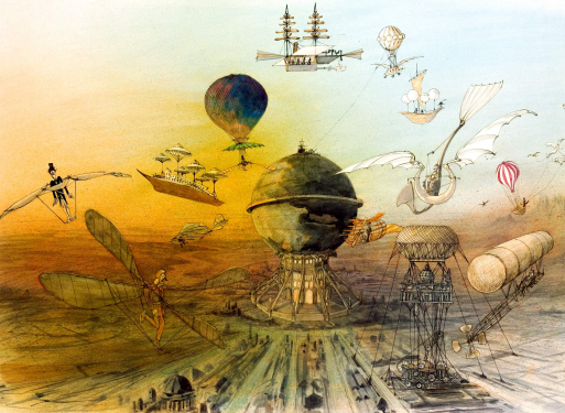
I came across illustrator Ralph Steadman when looking for examples of ink rotoscoping. I love his use of surreal characters and surreal scenes. His illustrations are very sketchy and rough just like the way my work tends to appear but Ralph adds more intricate details. Instead of just drawing the outlines of objects and characters within my piece maybe it would be good to try a more detailed piece in a similar style to Ralph. The surreal element it captured quite well within these pieces as animals have human characteristics and clothing and the scenery in some connote fantasy engaging me into the image as it is unlike anything I have seen within reality. Reflecting on this point it may be a nice idea to place my character within a scene where you think you know what it is but it may have a twist. Such as lollipops to represent trees. (I am obviously not going to use lollipops!)



Subscribe to:
Posts (Atom)