Sunday 25 March 2012

Rotoscoping - Jeff Scher


Jef Scher - New York based animator and painter

‘as an underground filmmaker, Scher uses lights, abstractions and visual effects all paired with music to create experimental short films. His films have been described as animated still life as they are made from various drawings in which the images change to trigger responses within the human mind.'

'Scher’s abstract films are all approximately two and a half minutes long. He feels that this amount of time is more than enough to allow the viewer to become engaged' - This quote has made me feel more confident in my decision to cut the music into a shorter section. I strongly agree with this quote as I feel a short piece that has been executed beautifully is something so much better than a longer piece that appears ok and won't hold the attention of the audience throughout the entire piece.

I have noticed while looking at his work that when he is rotoscoping he is using different mediums such as ink, paint, collage ect to suit that particular piece of music. The use of a multitude of mediums conveys the excited, upbeat tempo of the music. Reflecting on this i am thinking that i could show the music change by adding to the chosen medium of ink by possibly adding colour as suggested earlier in the project. I could add colour slightly to the background sliding from top to bottom to visual describe the sliding effect of the dreary sounds?

Sunday 18 March 2012

Project so far

After meetings with Rick, fellow students and individuals within the design industry i realised i had set myself a large task of making a music video that is 3 and a half minutes long. As discusses with Jon Turner and Claire Grey it was decided that it would be best to choose a section of about 30 seconds to a minute and gain a more successful and visually pleasing piece. Although it would of been nice to create the whole music video i feel that focusing on a section of the music will help my struggles of laying down some sort of narrative as i have been finding this difficult. I have chosen a section of the music where i feel there is most potential and would keep the engagement of an audience. I feel more confident now with my project and with a little help from Claire Grey at Kilogramme tomorrow i should be well on my way to getting stuck into the production.

Symmetry

So after this finding about Stanley Kubrick using symmetry to make an audience feel uneasy without actually realising that it is the background that is casing some subconscious confusion i thought i would have a go at creating my own symmetrical drawing and one drawn all by hand.
Although these images were intended to look slightly gloomy and sinister i do feel that the second drawing which is symmetrical does cause a different and uneasy feel. The corridor seems to appear longer and the door at the end more daunting, the lines of the carpet being symmetrical also encourage the viewer to follow them directly to the door more so that the first image all drawn by hand.

On the look out then for places that may cause this effect i noticed a road on a walk back from the train station one night and the placement of the trees seemed to create this symmetry that may appear to be unnerving and in some way surreal.

Thursday 15 March 2012

Vulnerability/Timid/Suspense


Although I don't intend to use this cartoon style I intend on addressing the emotion 'timid' so i thought it would be useful to look at the way in which the characters body language expresses this to it's audience. In this particular episode of Tom and Jerry 'Timid Tabby' the character on edge and you can tell this by the way the character clings to Tom, curling himself into a ball when alone and constantly looking around for danger. These characteristics could be shown throughout my animation to connote the characters vulnerability.

I then looked into the use of camera angles and shots to see how they effect the way in which the audience understand the characters power/vulnerability. I came across Kubrick's film The Shining and I found something very exciting and unexpected. It is said that Kubrick uses symmetry around the dominant focus (being the character) and the effect it has on the human eye and our reaction towards it.

'In Kubrick’s film “The Shining”, the use of symmetry is everywhere. This does subliminally hints at a number of aspects in the horror film..The first, and purely spacial change it can make comes from the psychology behind the use of symmetry to induce greater fear on the viewer. This comes from the emphasis of one subject in the particular shot. A focus of the viewer’s attention on one point for an extended period of time builds up suspense (as opposed to allowing the viewer’s eye to wander around the shot). There is an somewhat uneasy and unnatural feeling to a symmetrucal shot that adds greatly to the sense of suspense. By framing the subject in a symmetrical shot, it nullifies the set to an almost artificial backdrop. This, paired with the slow camera zooms, slowly torments the viewer into focusing on one thing and wondering what will happen to the single subject.'

You can see in these to film stills that the carpet and surroundings do create a symmetrical feel making me as a viewer feel slightly uncomfortable as this wouldn't happen in the natural world. This could be a perfect solution to create an unusual, uncomfortable experience to go with the feel of the music.

In this scene taken from the film you can see the symmetry as character Danny is moving around the corridors, the doors are opposite each other on either side and the carpets patter is symmetrical to where Danny is positioned.

Wednesday 14 March 2012

Industrial

Looking at the title of the album in which the song i have chosen is from 'The Sad Machinery of Spring' i thought it may be nice to look using industrial references and maybe use them along side of my forest idea or possibly create an industrial forest. This is just a rough idea to try and give myself options to where the character will be positioned. However i do like the idea of the character being lost in a forest as you could relate machinery to a flower maybe as it has the same routine (life cycle) just like machinery will be programmed to complete certain tasks. So from this i looked at a range of imagery to try and gain some inspiration for the scenery.


Ryan Woodward

I came across an animator/story board artist name Ryan Woodward today when i found a beautiful animation of two dancers on you tube called Thoughts of you (currently in the film festival circuit - current work). I love the simplicity of it, it looks unfinished yet it works ... similar to the Disney animatics i looked at. Symbolism is used a lot within this animation to portray love and freedom, like when the female spreads out her arms and they are wings, it also portrays a delicate and fragile nature. The female part in this animation seems to be dominating the dance as she moves across the screen and the male chasing or trying to hold on to her. The use of white to portray the female and the way the male is trying to hold her back connotes to me she may have been his lover and she has passed on and this is where the bird wings come into play they may portray her as an angelic figure ... she is free ... maybe she suffered before and now she is at peace. The reason i believe they are lovers is as the two characters come into contact there are symbols to represent the chemistry they share for example at the very beginning of the animation when they first tough a pattern to represent lightning wraps around their wrists connected them spiritually with each other a very obvious symbol for a spark, a passion. I also noticed that the male is drawn in black this will of been used in contrast to define the reality from utopia. I also think the black may have been used to show the pain he is feeling for her and he is trying to cling on to the memory of her hence the way she is dominating the routine. However at the end of the animation you see her colour change to black and as the male figure walks out of shot she is crouching down with heartache and it really makes you question your original thoughts.
"The film has a lot of symbolism that is meaningful to me but i wanted it to mean something to the individual" Ryan Woodward.

The making of 'Thought of you' was very interesting it gives you a bit of information of what Ryan was doing before this animation and what inspired him. I didn't watch the making of till after I had written about how I interpreted the animation and some of the things he says about symbolism as I mention before were spot on! His message was portrayed amazingly well through the symbolism and movement of the human form especially since the figures had no facial expressions!

"I love hand drawn animation, it has life to it, it’s not a mathematical algorithm that computed that, it has mistakes to it, I like that" Ryan Woodward. This is a quote that I made a note of while watching the making of which is exactly how I feel about hand drawn animation, it feels more personal, and it’s straight from the artist.
Another aspect of this piece is when the characters almost morph into different shapes or develops wings it think this will work extremely well as I am animating to music. It will add fluidity to the piece meaning it may not be necessary to cut to another shot.


Here is a short Google Doodle he did working again with Martha Graham (Choreographer) it is so sweet.
'Today's Google doodle honors choreographer Martha Graham's birthday and with animated dancers revealing it, the doodle also showcases the company's push to build a more dynamic Web'. http://news.cnet.com/8301-30685_3-20061774-264.html#ixzz09Tjd1Tro

Here is another one of his short animations this is called Ha-a breath of life (2009) and this clip is a segment that plays during the night show at the Polynesian Cultural Center in Laie, Hawaii.
In this animation i again love the simplicity, the use of silhouettes, colour pallet and intricate patterns/markings really does portray that tribal feeling.

After looking at these animations by Ryan Woodward i have realised that to portray the write message to your audience you need to carefully consider your composition, colour pallet and corrects method of animation/filming. This is going to be useful to me in the future as when i start my new project i am going to make sure that all these points are carefully considered because that is what i have been lacking ... creative decision making i have just chosen a colour/font because i thought it looked ok and not had any real thought behind it.

Tuesday 6 March 2012

Ralph Steadman

I came across illustrator Ralph Steadman when looking for examples of ink rotoscoping. I love his use of surreal characters and surreal scenes. His illustrations are very sketchy and rough just like the way my work tends to appear but Ralph adds more intricate details. Instead of just drawing the outlines of objects and characters within my piece maybe it would be good to try a more detailed piece in a similar style to Ralph. The surreal element it captured quite well within these pieces as animals have human characteristics and clothing and the scenery in some connote fantasy engaging me into the image as it is unlike anything I have seen within reality. Reflecting on this point it may be a nice idea to place my character within a scene where you think you know what it is but it may have a twist. Such as lollipops to represent trees. (I am obviously not going to use lollipops!)
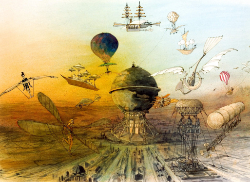
Surreal Animation

'Jan Svankmajer s a Czech surrealist artist. His work spans several media. He is known for his surreal animations and features, which have greatly influenced other artists such as Tim Burton, Terry Gilliam, The Brothers Quay and many others. Svankmajer has gained a reputation over several decades for his distinctive use of stop-motion technique, and his ability to make surreal, nightmarish and yet somehow funny pictures. He is still making films in Prague at the time of writing. Švankmajer's trademarks include very exaggerated sounds, often creating a very strange effect in all eating scenes. He often uses very sped-up sequences when people walk and interact. His movies often involve inanimate objects coming alive and being brought to life through stop-motion. Food is a favourite subject and medium. Stop-motion features in most of his work, though his feature films also include live action to varying degrees. A lot of his movies, like the short film Down to the Cellar, are made from a child's perspective, while at the same time often having a truly disturbing and even aggressive nature. In 1972 the communist authorities banned him from making films, and many of his later films were banned. He was almost unknown in the West until the early 1980s.'

Jan Svankmajer (Meat Love 1989)

Dimensions of Dialogue Part 2 (1982)

I find Jan Svankmajer's work to be very disturbing and creepy, i find it difficult to watch as it freaks me out so much. Everything is so surreal and unusual that it is bizarre to make sense of what is going on. I feel that the surreal aspect of Svankmajer's animation is something that will inspire my work but i don't want to make it so uncomfortable to watch. I'm sure that not everyone feels the same way as i do about his work but i would not enjoy working on an animation that would make me feel on edge before even showing my audience. As i said i will take some of the aspects from these animations into consideration but not so much the aesthetics.

Brothers Quay

What makes this animations stand out is the use of objects we know and recognise but their characteristics and movements we are unsure of. They create scenes where inanimate objects are portraying human characteristics and the audience may feel on edge and overwhelmed with questions that cannot be answered. I want to create a scene of unfamiliarity but nothing that is uncomfortable to watch.


Francis Bacon

'Bacon's painterly but abstract figures typically appear isolated in glass or steel geometrical cages set against flat, nondescript backgrounds' This statement could connote the feeling of being trapped and obviously isolated which is a similar atmosphere i am trying to create within my animation. The dark colours and disturbing images create a disturbing and unnerving feel which are another two themes i want to portray through out my piece. The faces within the first 2 images below are disturbing, they look like they are in pain and distress so if i include a character within my animation maybe this would be a good way forward to make my audience feel on edge just like the tone of the music.


Surreal Artists - Andre Masson

Andre's early works portrayed interest in Cubism but then he later became associated with surrealism. He created numerous automatic drawings in pen and ink which is the reason in which i feel he relates to my style of animation with the ink and stick method. I like the use of freedom, expression and personality within each frame when using this technique.
'Automatic drawing (distinguished from drawn expression of mediums) was developed by the surrealists, as a means of expressing the subconscious. In automatic drawing, the hand is allowed to move 'randomly' across the paper.' - Similar to the style of the line drawings looked at towards the beginning of the project.
Examples of Andre's Works:-

Monday 5 March 2012

Panorama - Britain's Hidden Alcoholics

In a group discussion Rick had said he had seen the ink style similar to that I used for my Feel Good Drinks brief. At 5:25 the live action sequence turns into the what i presume is rotoscoped. The reason I like this is because i have been struggling to draw trees for my forest feel and i think this effect is nice it also shows a lot of space and emptiness which could possibly connote being lost and confused.